
Lesson 1
Ideas Generation Process – 2D/3D/Pixel Assets
- Mind Map/List ideas
- Research (Moodboards)
- 4-6 Sketches/Photobashes
- 2-3 Finished Designs
- 3-4 Colour Ideas
- Finished Image
Exquisite Corpse Activity
In this activity we folded up a piece of paper into 3 sections and drew the head, body or legs for characters one part at a time while passing them around the room so we ended up with a full character. I liked this activity as you don’t need a full character idea, you could just have a good idea for a head and see how it fits together in the end. This technique is quite good to use if people are willing to help you with it.
These are the exquisite corpses I did, I did the bottom section here:
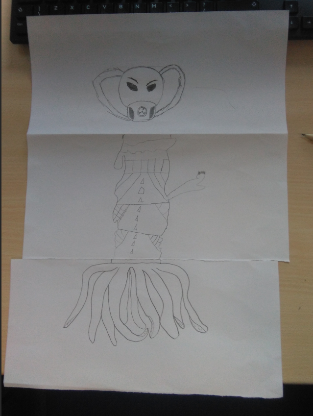
The top section here:
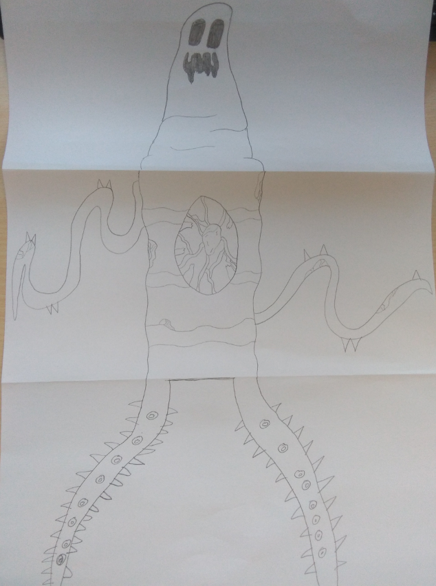
And the middle section here:
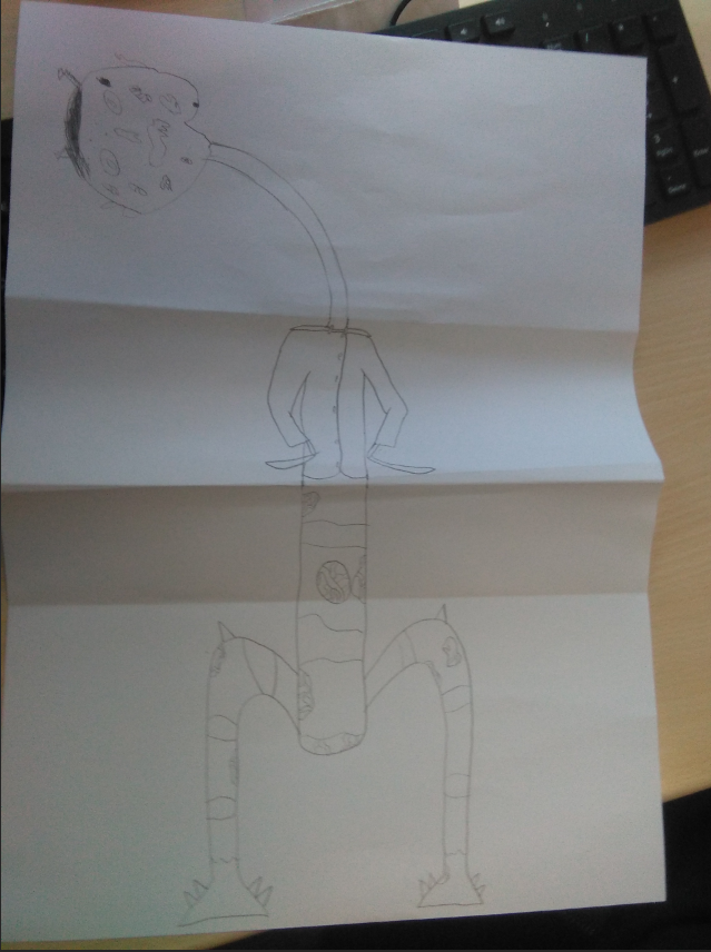
Photo-bashing activity
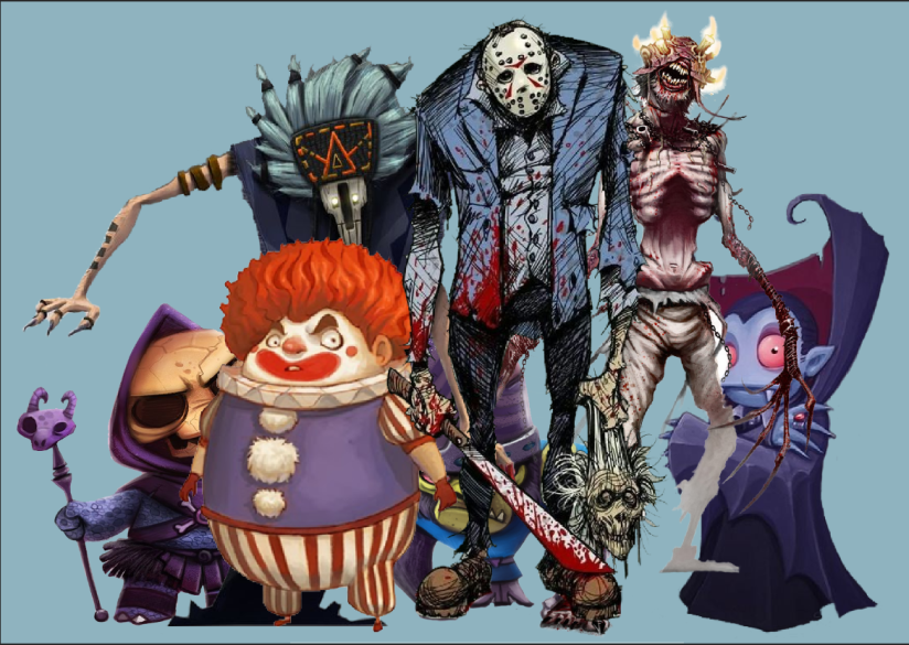
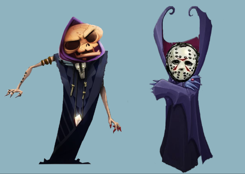
In this activity we were given a series of characters to cut up in Photoshop and mix them up to make new ones. This activity was fun as it gave me the opportunity to learn photoshop and create some ideas. This technique is very useful as I could use it to mix together a couple designs in the future to give me more ideas.
These were the characters I started with:
These are the two characters I made from them:
This part of the lesson was useful as it taught me how to use some of the basic tools in Photoshop.
Self-Directed Photo-bashing Practice
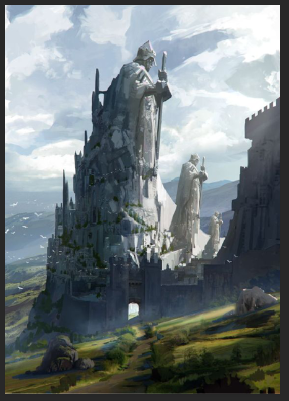
In this section I will be doing some photo-bashing for a fantasy environment concept because I thought it would be good practice. I found 3 reference pictures that I thought would fit together well in terms of colour and style. These are the references I liked:


I picked these because I think that the castle with the statue on the right reference would be a good center piece for a piece of concept art and I could change up the background by adding some of the mountains and scenery in the other 2 reference pictures.
I used the statue reference as the base starting picture:
I then started to cut out pieces that I thought would go together well with the background. I cut out the front most mountain piece from the middle reference:

Then I added it to the base picture and changed up the brightness a bit to blend it in:

I then used the mountain from the left reference and flipped it around to put behind the statue and to make a small rock in the bottom left corner. This is how my finished photo turned out, I will display it next to the starting picture to see the changes I made.
Starting picture:

Finished photo-bash:
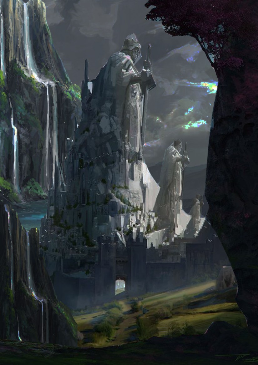
I really like how this turned out because everything fits together really well. I tried to make it look like it was night compared to the daytime version on the starting picture. I particularly like how the mountain and rock turned out. One thing I think could have gone better is how much pictures look overlapped, for example, I had to overlap the statue to hide the mountain, to make it look like its in front and the mountain is in the distance. One thing I need to work on is cutting out smooth pictures. I will consider this in my next photo-bash.
Character Designs Using Templates
In this activity we were given templates to use to create characters. I liked this activity as it allowed me to get more ideas for techniques to use when generating ideas. This technique is useful as you don’t need to have an idea for a character to make a good design when using templates.
These are the 4 characters I made from them:


I like the top left character on the left picture as its the most detailed and I think that template suits a dwarf character.
This lesson was helpful as it helped me learn some new techniques to use in the design process. I will use these techniques to help improve my work when I do my final piece.
Lesson 2
In this lesson we will be looking at using graphics tablets in photoshop.
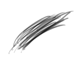
First we looked at how to use pen pressure on the drawing tablets and got used to the feel of them by doing playing around with the pen pressure in Photoshop:
Then we looked at how to make the brush look more like a pencil:
After we got used to the tablets we got some concept art to trace online:


We chose the one we liked and had a go at tracing over them with the graphics tablets in Photoshop. I picked the sword.
This is how mine turned out:
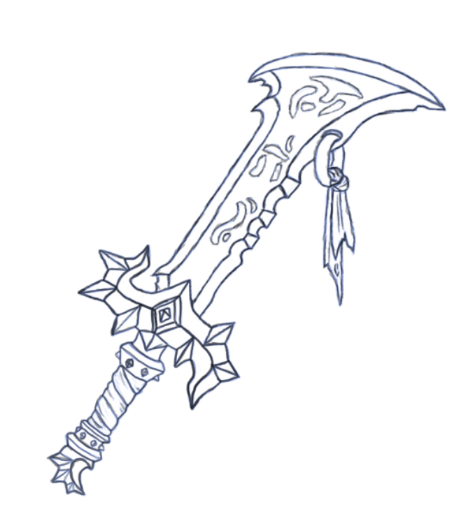
I think this could be better as the lines are a bit too dark.
Next we practiced colouring and blending to make our pieces look hand painted. We did this by looking at two painted spheres and trying to replicate them underneath.

First we just made one out of basic flat shapes with the elliptic marquee tool:

Then we started adding more colour to make it look more 3d:

Then we used the blend and blur tools to make it look more hand painted:
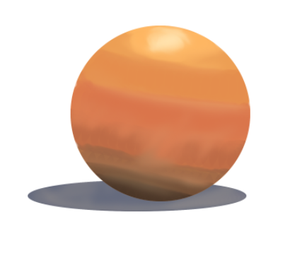
This activity was useful as I learnt how to use a variety of tools to create a 3d looking object.
Next, we went back to the sword we did earlier and tried to cel-shade it. Cel-shading is when there is an outline to the edges with a darker colour than the middle. This is what I did:

I’m happy with how this turned out as the outlined colours go well with the original colours. I particularly like the gold ring with the piece of fabric as it has good shading and the colour suits the sword.
Lesson 3
In this lesson we will be looking at tile sets and level design. First we made a list of things that would be used in a 2d platformer:
- Avatar – animations
- Enemies – animations
- Collectibles – coins, rings, keys, weapons
- Traps – spikes, false floor, water/lava, fake collectibles
- Boosts/power ups
- Score/timer
- Health/lives
- Background
- Leaderboard
- Platforms
- Checkpoints
- Tasks/objectives
- Movement aids – ladders, springs
- Obstacles
- Triggers
We then looked at an explanation of the 5 main components in a game:
Platforms – any object that the player runs or jumps across.
Obstacles – any object that is capable of imparting damage to the avatar.
Movement aids – any object that helps the player traverse the level, such as springs, moveable trampolines, and ropes.
Collectible items – any object that provides a reward to the player.
Triggers – anything that changes the state of the level. Examples include switches that turn blocks into coins, or objects which change the avatar’s behaviour.
Next we brainstormed a list of ideas based on the theme horror.
Locations
- Hospital
- Insane Asylum
- Derelict Areas
- Underground areas
- Metro Station
- Mansion
- Sewer
- Dark Forest
- Graveyard
Enemies
- Doctors
- Insane Patients
- Monsters
- Bats
- Rats
- Wolves
- Zombies
- Ghosts
Interactive Elements and Objects
- Switches
- Keys
- Doors
- Elevators
- Beds
- Windows
- Closets
- Chests
Next, we made some tile sets in Photoshop based on our list on horror elements. The location I chose was Insane Asylum. First I did the outlines on one layer:

Then I coloured them on a different layer:

I like how these turned out and think they would suit a horror game well.
Lesson 4
In this lesson we will be looking at illustrator and creating some 2D assets using vector art.
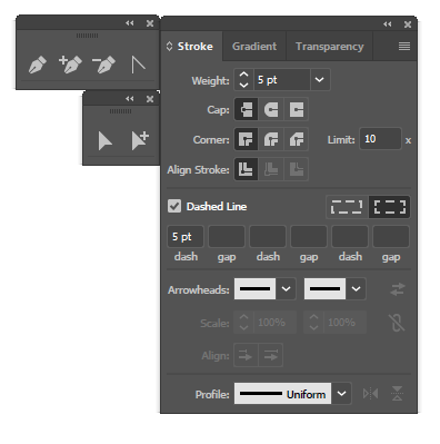
We started by looking at the stroke, pen and selct tool windows and dragging them to the work space to allow a faster workflow:
We then played around with the pen tool and shape tool to make a series of shapes to get used to the feel of them.
We were then given a sheet with some assets on them that we had to try and recreate in Illustrator. These are how mine turned out.

I really like how the chest turned out because it looks like it can be used in a tile set, same with the crate. I think that I could have spent a bit more time on the grass piece to give it some lighting and make the curves of the shapes more smooth.
Lesson 4
In this lesson we will be looking at pixel art. First we looked at all the resolutions that are suitable for game assets. These are:
- 16 x 16px
- 32 x 32px
- 64 x 64px
- 128 x 128px
- 256 x 256px
- 512 x 512px
- 1024 x 1024px – ideal for tileable backgrounds
Next, we made a pixel art sword using the resolution 16x16px. Starting by blocking out the shape of the sword:
![]()
Then adding the colour.
![]()
Then, using the skills we learnt, made the same sword using 64x64px:
Starting by blocking it out:
![]()
Then adding the colour to the handle:
![]()
Then the blade:
![]()
I then added some blood to the sword for more detail. This is my finished sword.
![]()
I really like how this turned out. I like the handle in particular as it looks the most 3d with the shading.
Next we found another asset that we liked, for me it was the chest I did in week 3. And we tried to make our own in photoshop.
First I blocked it out:
![]()
Then coloured it:
![]()
This lesson was helpful as I learnt how to effectively produce pixel art. Blocking out the pixel art made it a lot easier for me as well.
Lesson 5
In this lesson we will be looking at silhouetting, grey scale and sketching faces. First we looked at effectively structuring a face by using guidelines:
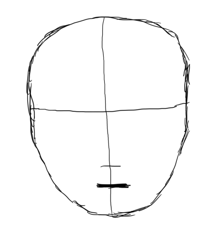
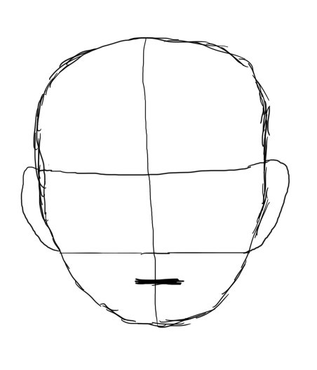
From doing these guidelines we had a good idea of where the bottom of the nose, ears and the mouth would be. Then added the ears:
I then added all the details:
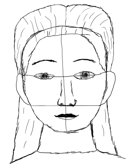
Then erased the guidelines:

This activity was useful as it is an effective way to create a convincing face.


Lesson 6
In this lesson we will be looking at animation. We started by creating a list of different animation techniques:
Traditional Animation
- Hand Drawn
- Rotoscoping
- Cel Animation
Computer Animation
- 3D
- Motion Graphics
- 2D
- Gif
- Flash
- Toon Boom
- Photoshop
Stopmotion
- Clay/Plasticine Animation
- Object
- Pixilation
- Model Puppet/Armature
- Cut Out
Experimental Techniques
- Sand Animation
- Flip Book
- Oil on Glass
- Drawn on Film
Next we made some animations of a bird flying using the timeline in Photoshop:

We put together a series of frames to create the illusion that it is moving. Then I made it move across the page:

We then made a walk animation for a skeleton:

Then we tried to hand draw our own animations, this is how mine turned out:

Lesson 7
In this lesson
